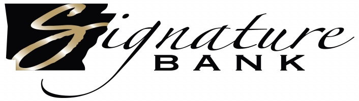
This version has been dubbed the Signature Bank of Arkansas Primary Logo and should be the first selection when the context of your design allows. The primary logo should be used when on a white or light background.

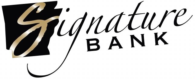
There are a variety of acceptable variations of the Primary Signature Bank Logo. All acceptable versions are shown below. If not shown here, it is not an acceptable variation.


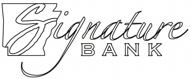
The white outline with the white "S" should only be used when no other logo is an option. There are very few circumstances when this should be used.
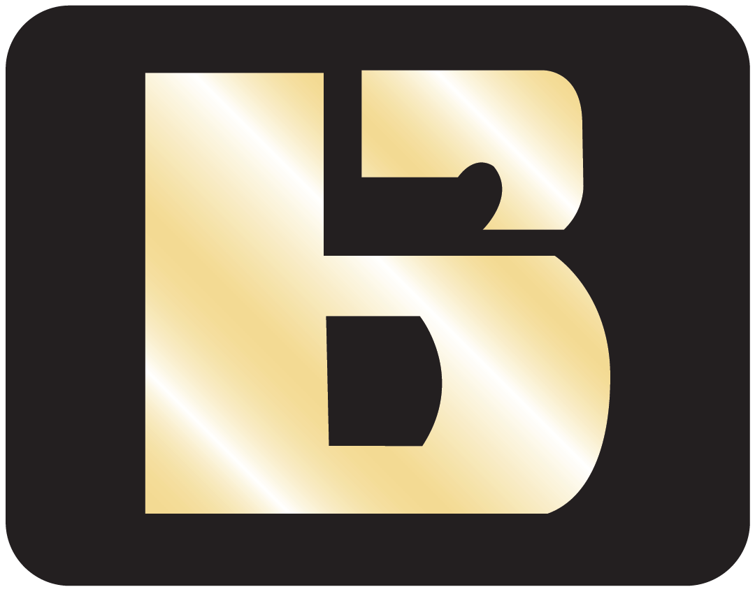
The Signature Bank icon can be used in instances where vertical and horizontal space is limited. The icon should only be used if there is accompanying branding to support the mark. For example, the icon makes a great social avatar. This is an acceptable use case because the name Signature Bank of Arkansas appears elsewhere on the profile.


The white outline with the white "S" should only be used when no other logo is an option. There are very few circumstances when this should be used.


The following are approved subsidiary logos of Signature. Similar to our department logos, all of these are compliant with the guides provided in the initial example. When creating any new logo, use the guides to create consistent positioning, spacing, sizing, and colors. When used, the guides allow us to create multiple, distinct logos without opening the visual brand to inconsistencies. Any new logos must first be approved by the Marketing and Brand Department before use.
Banco Sí is a curated banking experience within Signature Bank of Arkansas. All of our staff is bilingual in Spanish and English, giving customers the ability to bank in their preferred language. Below are acceptable logos for Banco Sí.


The white outline with white "S" should only be used when no other logo can be used. There are very few circumstances when this logo should be used.


The white outline with white "S" should only be used when no other logo can be used. There are very few circumstances when this logo should be used.


The white outline with white "S" should only be used when no other logo can be used. There are very few circumstances when this logo should be used.


The white outline with white "S" should only be used when no other logo can be used. There are very few circumstances when this logo should be used.
Shown below are varying department logos. All are compliant with the guides provided in the initial example. When creating any new logo, use the guides to create consistent positioning, spacing, sizing, and colors. When used, the guides allow us to create multiple, distinct logos without opening the visual brand to inconsistencies. Any new logos must first be approved by the Marketing and Brand Department before use.


The white outline with the white "S" should only be used when no other logo is an option. There are very few circumstances when this should be used.


The white outline with the white "S" should only be used when no other logo is an option. There are very few circumstances when this should be used.


The white outline with the white "S" should only be used when no other logo is an option. There are very few circumstances when this should be used.
A lockup should be used when both the Signature Bank logo and the Banco Sí logo are needed. Below are the acceptable logo lockups. Note that the Arkansas icons are aligned when placing the logos side by side, and the logos are never stacked.


The white outline with the white "S" should only be used when no other logo is an option. There are very few circumstances when this should be used.
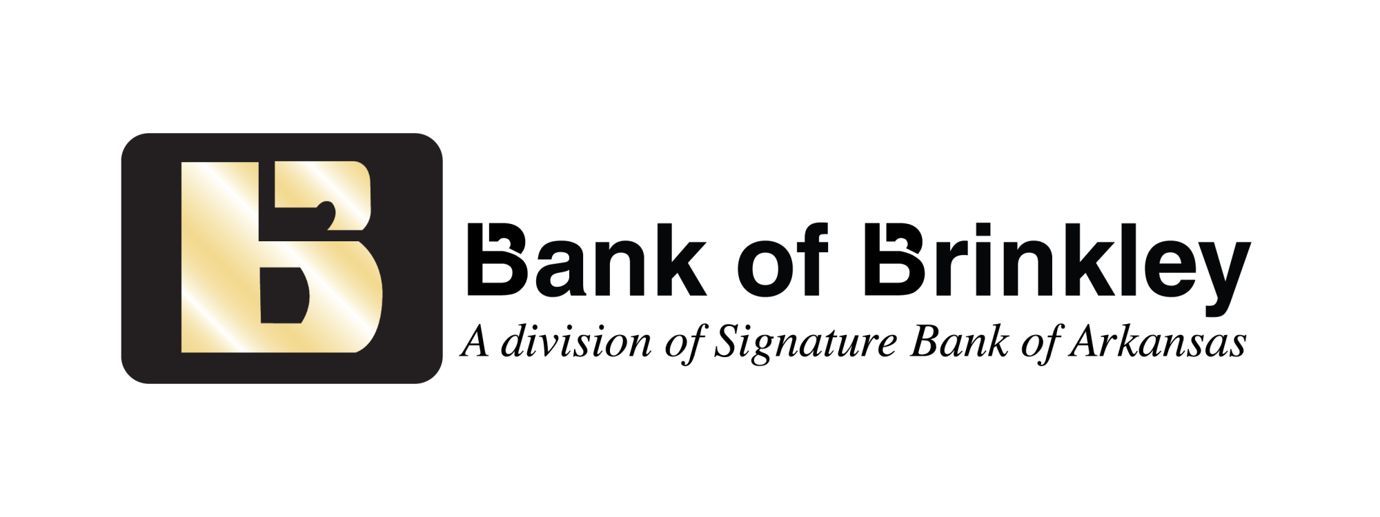
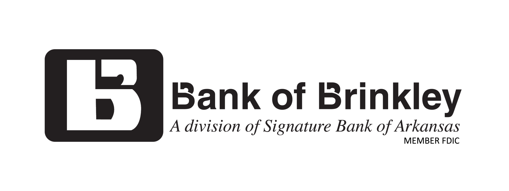
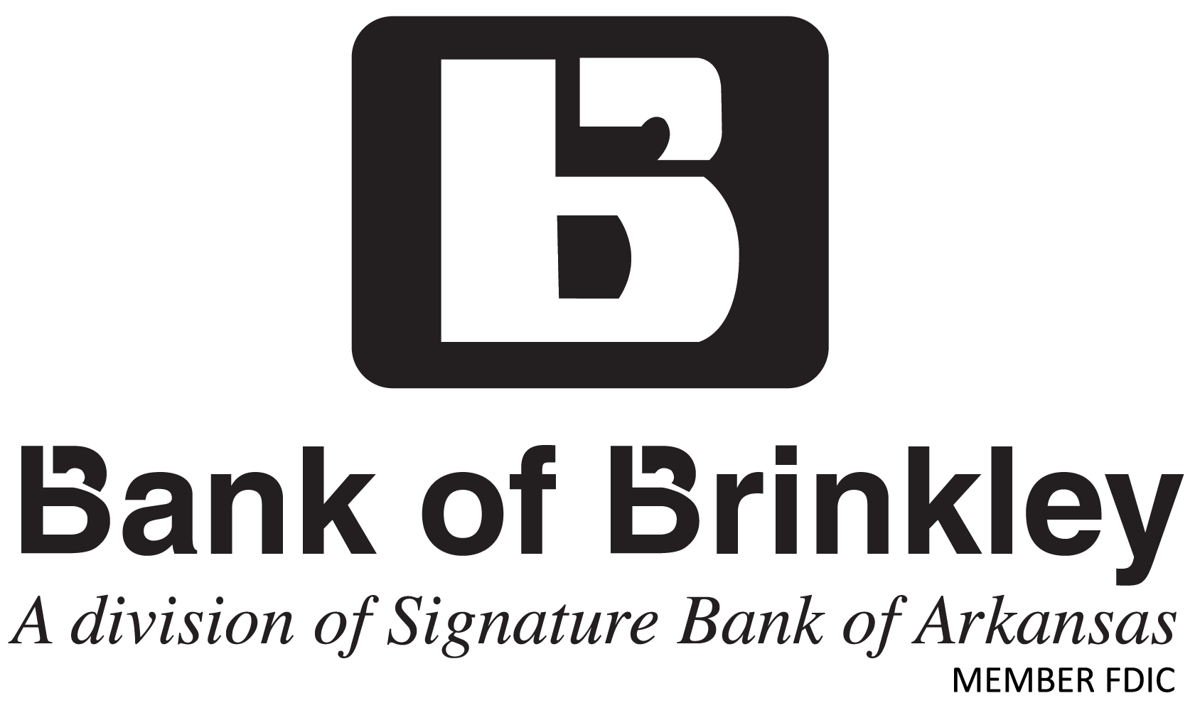
Signature’s presence in Brinkley reaches back to the founding of the Bank of Brinkley in 1903. We love tradition, which is why the Bank of Brinkley logo and its branding elements are more prominent than "Signature Bank of Arkansas" throughout the Brinkley community. All of the following logos are accceptable to use when representing this division of our bank.

It’s important to follow brand identity sizing guidelines. When used at smaller sizes than those shown below, letters bleed together, customers will not be able to read important details, and printed materials become blurry. Be sure to follow these guidelines for digital and print applications.
Shown below are incorrect instances of logo usage. Never outline the logo, rotate it, add a drop shadow, warp, or alter the logo in any way. This is extremely crucial to creating a consistent and professional brand experience.
Do not change the color of the logo
Do not use drop-shadows or effects
Do not outline logo
Do not stretch the logo
Do not rotate logo
Do not shear, skew, or add transform effects to logo
Do not alter letter spacing
Do not apply additional gradients
Utilizing abstract architectural details and textures is key to the Signature visual identity. They help create depth and dimension within our simple color palette while maintaining a refined, professional aesthetic. These patterns are widely used for collateral materials, web and digital marketing, signage, posters, and other printed pieces.