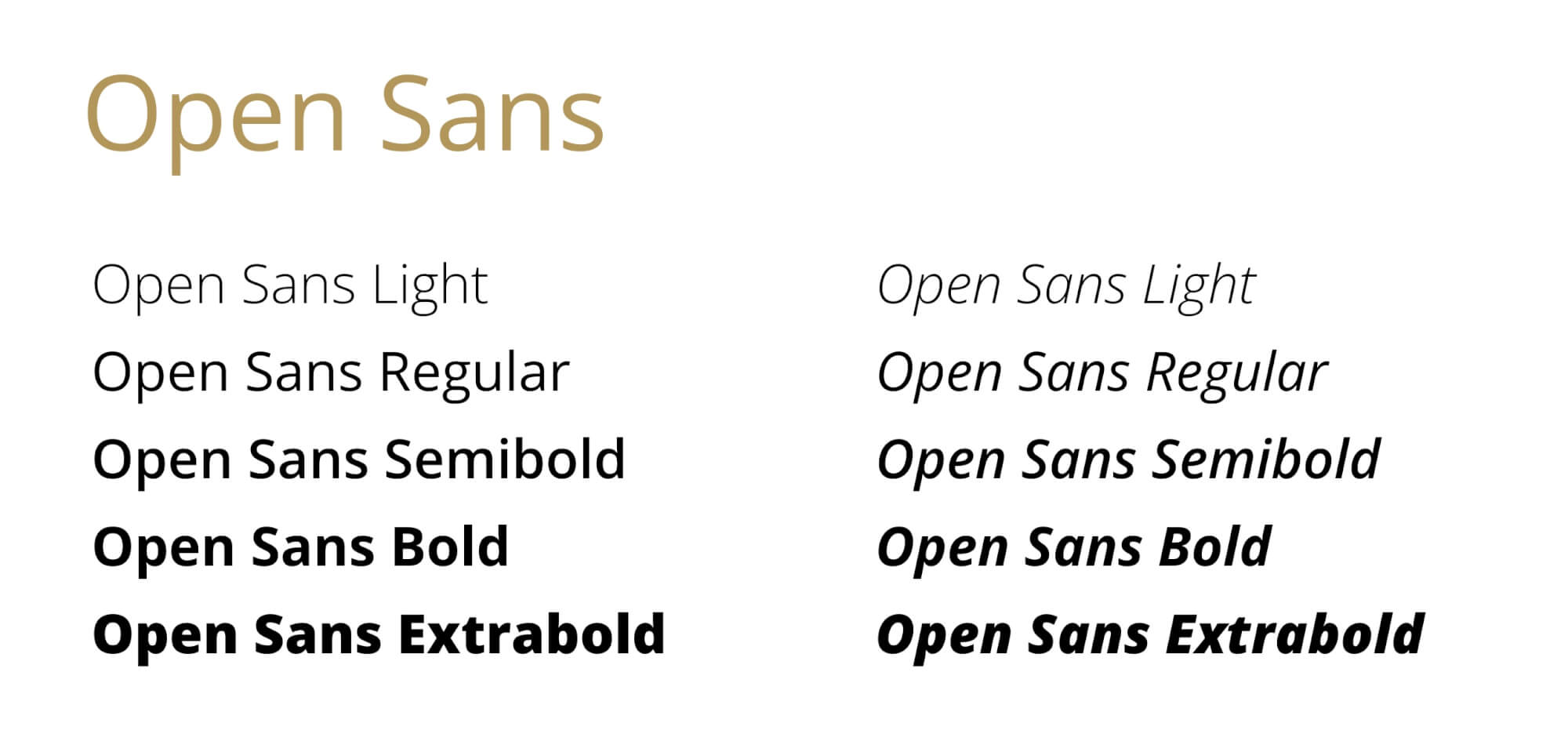
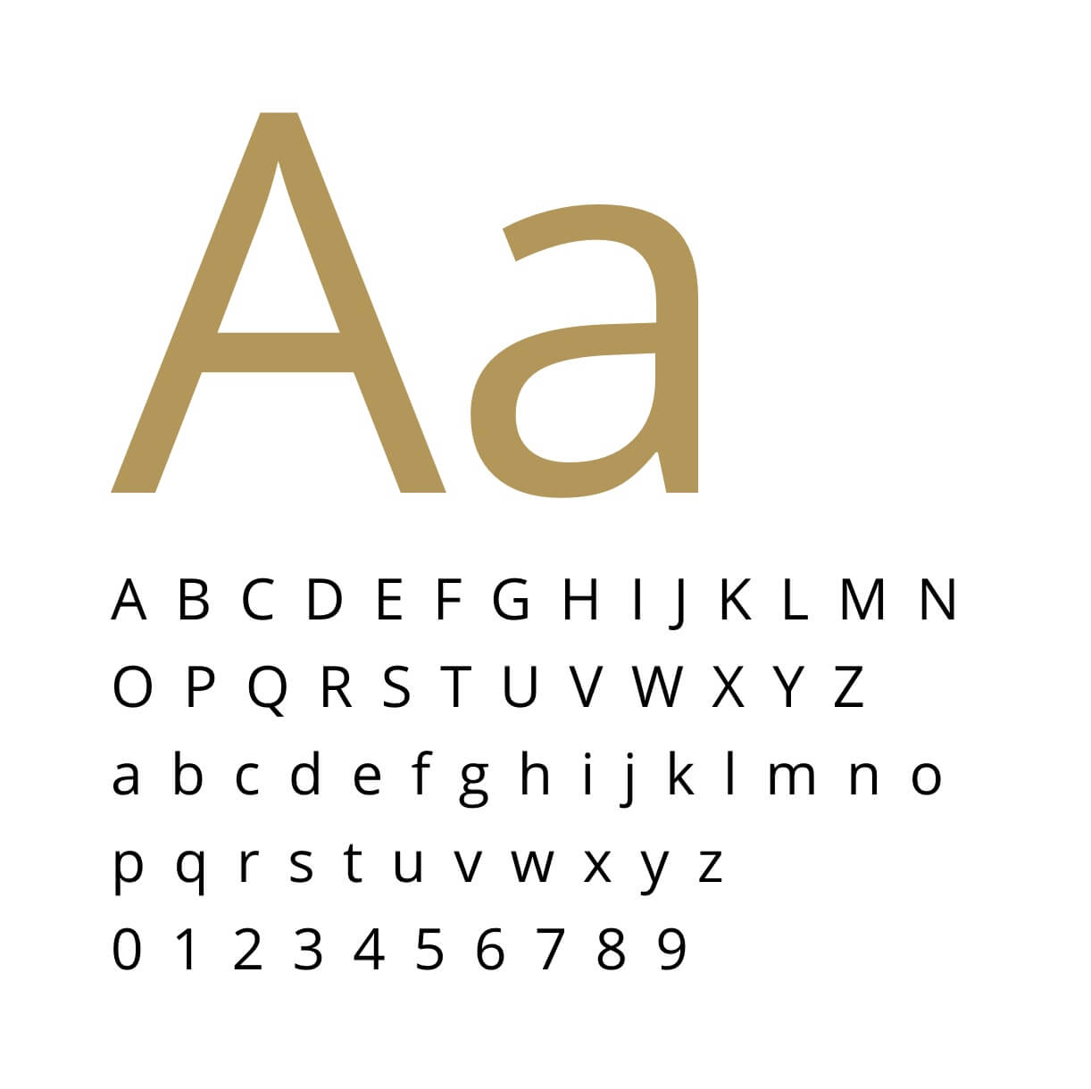
Signature’s Primary Typeface, Open Sans, ensures our copy is easily read and understood. All text, whether displayed in digital or print formats should be set in Open Sans font. Open Sans features clean, modern lines in a variety of weights and formats. Due to the massive size of this font family, we are able to leverage a single brand font for a variety of needs.
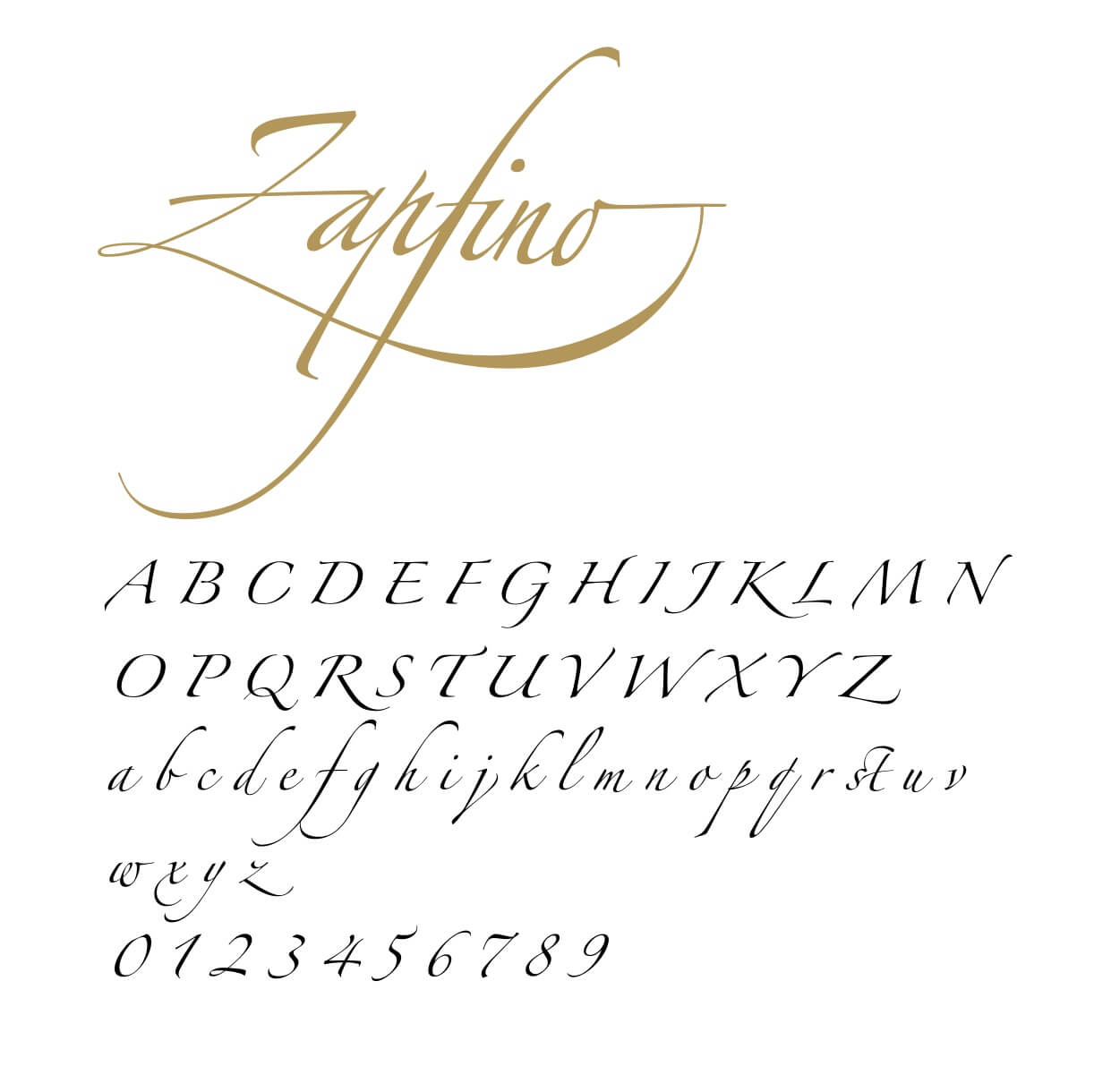
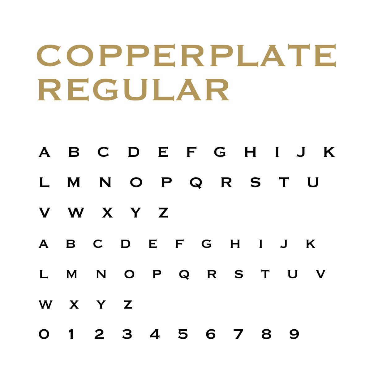
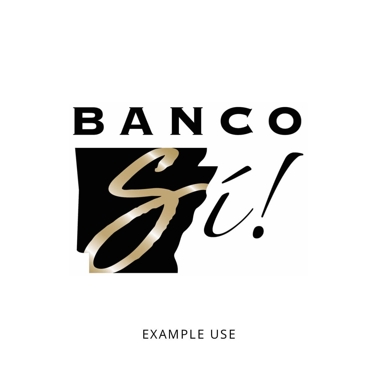
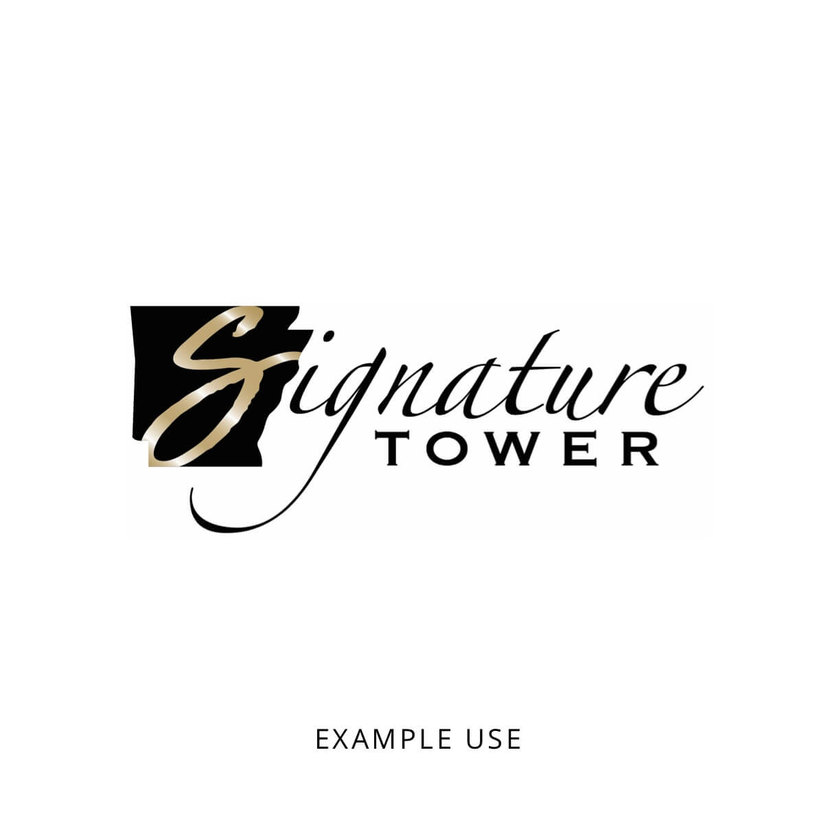
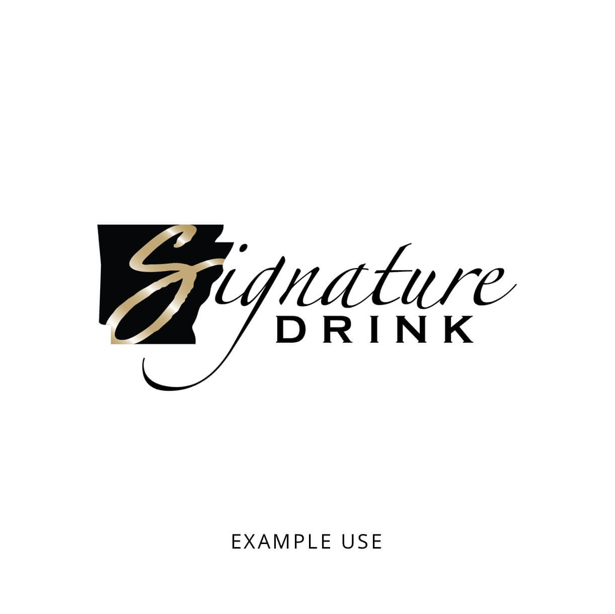
The secondary typefaces are Copperplate Regular and Zapfino. They are only used in very specific instances. Zapfino is the script typeface used to create the script "ignature" portion of the Signature Bank of Arkansas Primary logo. Copperplate Regular is only used to create the word BANK in the Primary logo. These typefaces should only be used when creating additional variations of the logos such as "Signature Tower" or "Signature Drink" as seen below. Additional variations of the logo and logo marks should only be done with the permission of the Marketing and Brand department.
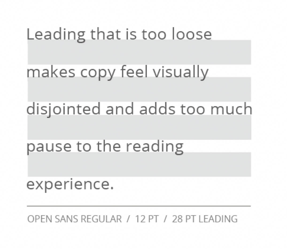
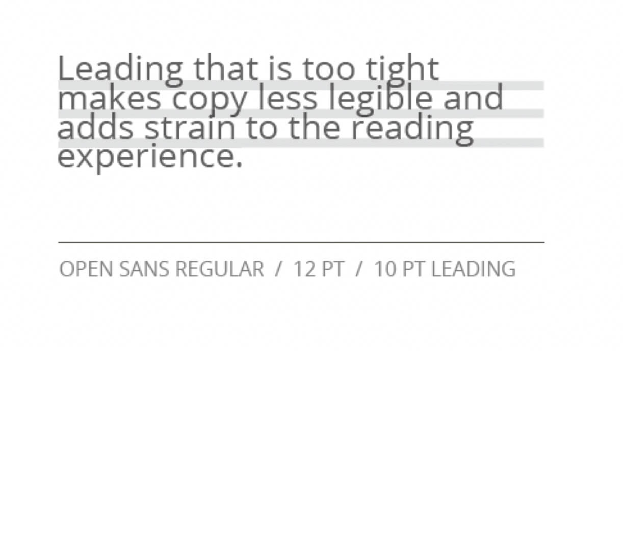
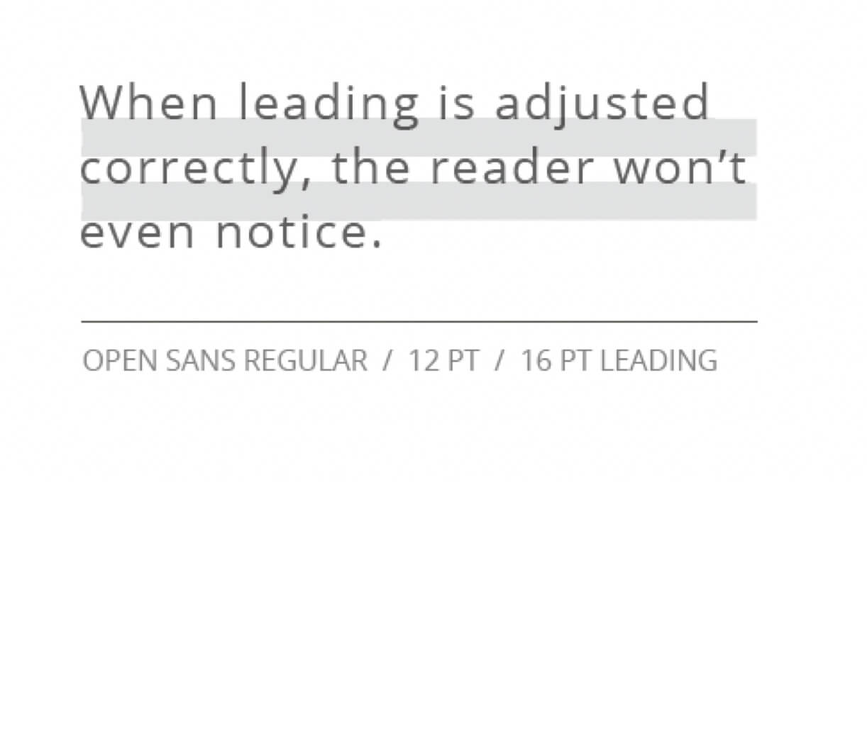
In addition to correct font usage, it is important to create a consistent visual and reading experience for users. To accomplish this, use consistent leading (space between each line) and tracking (space between each letter). The proper settings for each are shown below.
At Signature, we use a variety of different type treatments to convey a strong sense of structure and visual hierarchy. Shown below is the level of hierarchical structure that should be used in all communication. Note that Open Sans is used in different weights and sizes to create a visual hierarchy for messaging. Also, note the balanced spacing between each of the elements. This creates breathing room. Strive to be consistent when displaying the proportions of our type treatments.
